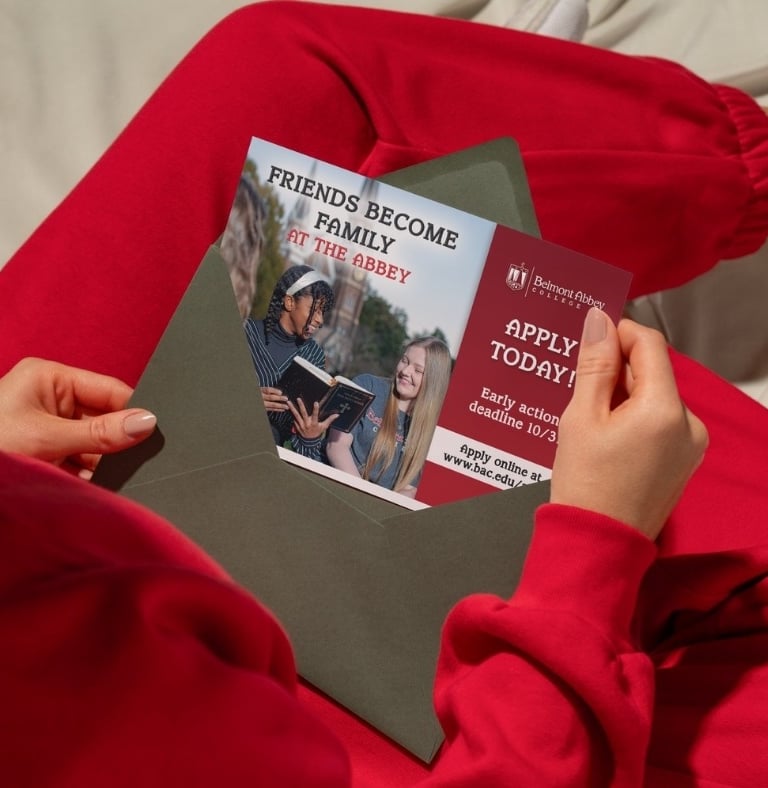
Belmont Abbey College
My process for designing a print ad for a new construction project.
PORTFOLIO
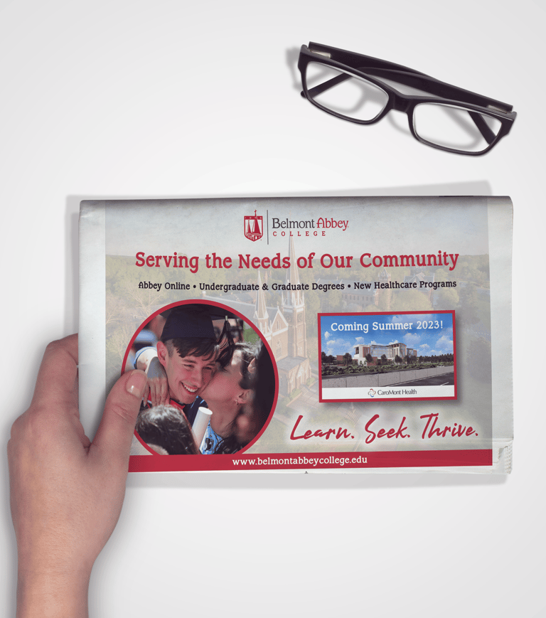
The Challenge
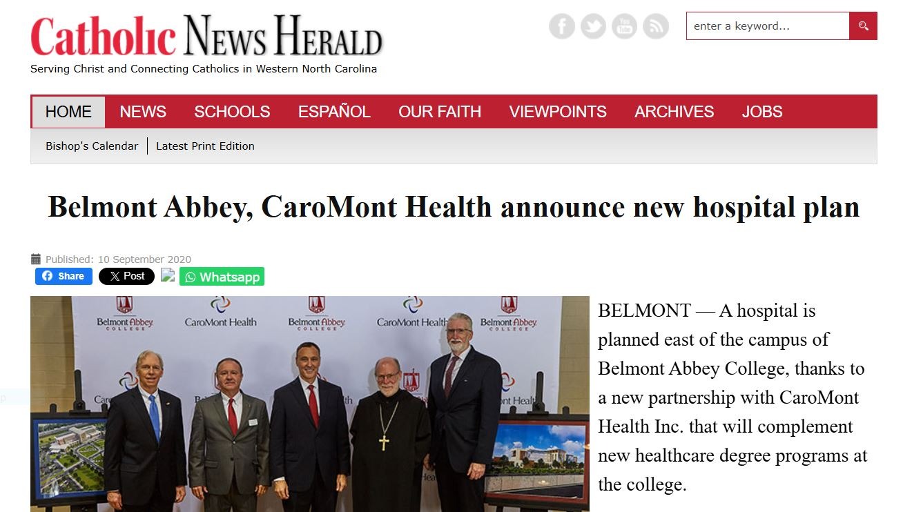
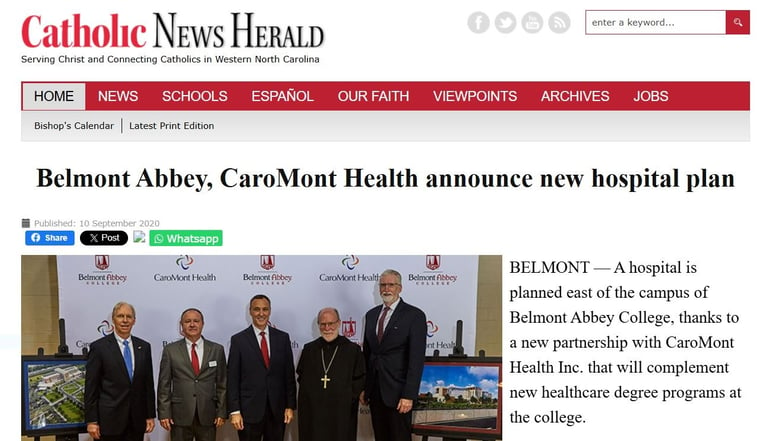
During my time working at The Abbey, a new hospital was under construction. This major project was set to not only serve the community, but also open doors for students to complete a nursing program at the college with the chance to begin work right after graduation. Belmont Abbey College partnered with Caramont Health for this project, and they wanted to share this with the surrounding community.
My role in this project was to design a newspaper ad for a local newspaper to share the project and garner support for fundraising to ensure the completion of the hospital on time.
Constraints
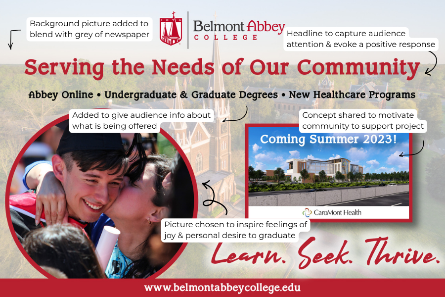
Working with newspaper print is different than a typical flyer. Not only are there certain dimensions, but the paper the graphics are printed on have a different affect on the final product. With this in mind, I carefully selected the colors used to account for the grey backdrop of the newspaper.
There were also specific components requested for the ad:
A clear picture of the construction site
A picture from a graduating class of Belmont Abbey
The Process
I was given a concept image for the hospital to be used, as well as the Caramont Health logo. Since Belmont Abbey already had a full brand suite, I had access to the logo, fonts, and color pallet to use as needed.
I first wanted to find the picture I would use to in the ad to inspire future graduates to join the program. While looking through pictures from past graduations, I found a beautiful picture of a mom and son after the son graduated with his degree from Belmont Abbey. I chose this picture because I felt it would evoke feelings of joy and motivation to graduate too.
After finishing a first draft with a solid color background, it became apparent that it would not work for the ad due to the finish of the paper used for print. As a fix, I added a translucent drone shot of the school's monastery to blend with the paper.

Lessons Learned
One of the first things I learned from working on this ad was the importance of understanding the print material used for the final product. Because I had never worked with a newspaper ad before, I didn't realize that the paper would have such an impact on how the design would turn out. Not only did I have to adjust the background for the final print, I also needed to ensure the typography was legible as well.
Another takeaway for me was a note of improvement. Having studied UX/UI, I see the gap where a call to action would have been helpful in achieving the goal of building community support. While this ad was overall good, a CTA would have brought it all together.
See more of my designs from Belmont Abbey College